Realism is the style that stops people. You see it in person — a portrait on an arm, a wolf across a shoulder blade — and for a moment you genuinely wonder if it's a photograph. That reaction is the goal. Achieving it on living, curved skin, with instruments that deposit ink rather than capture light, is arguably the most technically demanding thing a tattoo artist can do.
It's also the style where the gap between exceptional and mediocre is most visible, most permanent, and most expensive to address. More than in any other style, realism makes artist selection the single most important decision you'll make in the entire process.
What Realism Actually Requires
Photorealism on skin requires the artist to solve a problem that photographers and painters don't face: reproducing tonal depth on a surface that is curved, living, and will heal differently across different areas. The margin for error in realism is visible in a way that other styles obscure — a misplaced shadow in fine line botanical is absorbed into the overall design; a misplaced shadow in a portrait is simply wrong.
What separates genuine realism artists from artists who attempt realism: the ability to control tonal value with absolute precision, deep understanding of how fresh ink heals (realism always looks more saturated on the day than it will healed — experienced artists compensate for this), and the willingness to tell you what won't translate before you commit to it.
"Fresh realism lies. It looks better than it will heal. The skill is understanding the gap between what's on the skin today and what will remain in six months — and working backwards from the healed result."
Colour vs Black-and-Grey Realism
This is the first real decision in commissioning realism work, and it has significant implications for both the execution and the long-term result.
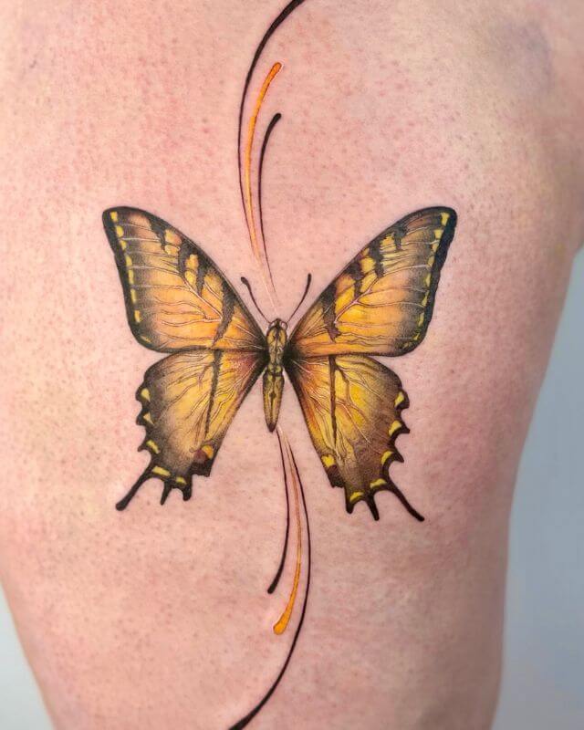
Colour realism attempts to reproduce the full photographic tonal range including hue — the warm skin tones of a portrait, the green of an eye, the gradient of a sunset. This is exceptionally difficult. It requires deep knowledge of how ink colours interact with each other and with different skin tones, how they shift over time, and how to layer them to create depth without muddying. The number of artists who execute colour realism at a genuinely high level is significantly smaller than those who attempt it.
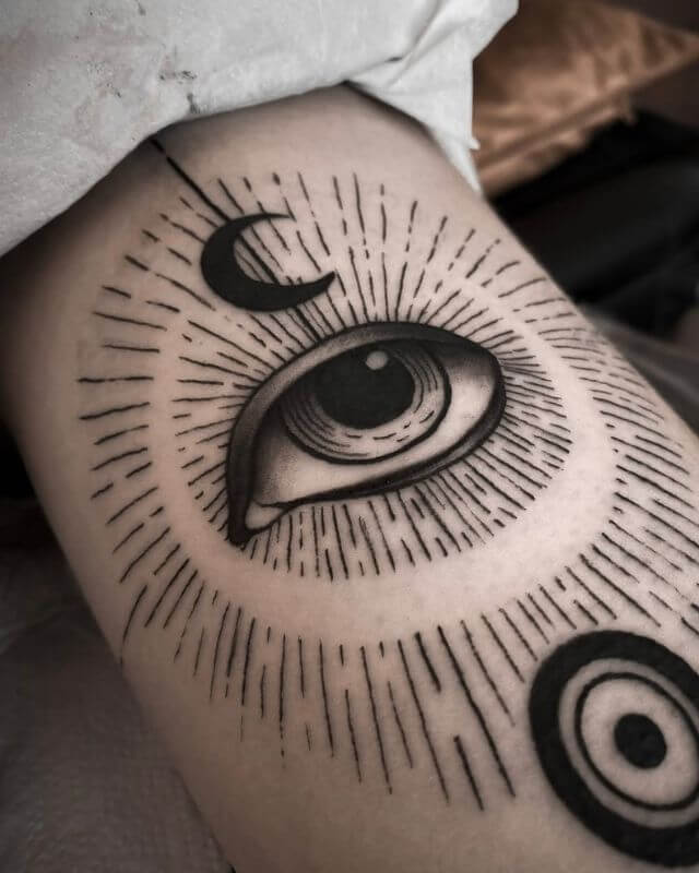
Black and grey realism uses diluted black ink — different concentrations of wash — to create photorealistic tonal depth without colour. It's more forgiving to execute (fewer variables), generally ages more predictably, and produces results that often read as more timeless. The high-contrast, monochromatic aesthetic of B&G realism has a permanence that colour work sometimes lacks as it shifts with age.
B&G realism is the more common choice for these reasons — not because colour realism isn't capable of extraordinary results, but because the bar for executing it well is significantly higher.
Subject Matter That Works and Doesn't
Subject selection matters more in realism than in almost any other style, because realism's entire effect depends on tonal contrast and defined edges. What works:
- Portraits — Human and animal faces, when the reference photograph is high quality and the artist specialises in portraiture. The relationship between light and shadow in a face is what realism was built for.
- Wildlife — Fur, feathers, and scales all translate exceptionally well into B&G realism. The texture work required maps directly to what skilled realism artists do best.
- Objects with strong tonal contrast — Watches, mechanical objects, skulls, flowers in high contrast. The tonal variance is already built into the subject.
What doesn't translate as well: subjects with soft, even tonal values — pale blue sky, flat surfaces without strong shadow, subjects where the detail that makes them interesting is colour rather than form. The skin's natural texture becomes more visible in large flat areas, which disrupts the photorealistic illusion.
Reference quality matters enormously. A blurry, low-resolution, badly lit photograph cannot be translated into a high-quality realistic tattoo — the information isn't there. The best realism artists will ask for multiple reference images and may decline to work from material that won't support the quality of result they can produce.
Placement Matters More Here
Realism is less forgiving of poor placement than any other style. The fine tonal graduation that creates depth and the illusion of dimension requires flat, stable skin to read correctly. Curved surfaces distort it. High-movement areas stretch and compress it.
The inner elbow, behind the knee, fingers, and feet are the worst placements for realism — high movement, thin skin, and areas where the ink simply doesn't deposit or hold as reliably. An artist who tells you to reconsider placement for a realism piece is giving you valuable advice, not creating friction.
What Makes a Realism Artist Exceptional
Portfolio assessment for realism is different from other styles. What to look for:
- Healed work. Ask specifically for healed photographs. Fresh realism always looks better — the distinction is how well the tonal structure holds once the skin has processed the work. This is the real test.
- Consistent tonal range. The deepest blacks and the highest lights should both be present and distinct. Muddy midtones with no real blacks or whites suggest technique that won't age well.
- Reference honesty. Does the artist show you the reference image alongside the tattoo? The willingness to be directly compared to the source is a confidence signal.
- Willingness to turn work down. The best realism artists will tell you what won't work — a reference that lacks detail, a placement that won't hold, a scale that's too small for the level of detail you want. That honesty is the marker of someone whose first priority is the final result.
The Honest Conversation About Aging
B&G realism typically ages gracefully. The contrast softens over time — the deepest blacks lift slightly, the brightest whites settle — but the tonal relationship between values holds. A well-executed B&G portrait in fifteen years reads as a portrait. The craft is still legible.
Colour realism is more variable. Bright colours shift — saturated reds warm, cool blues fade faster than warm tones, and the subtle colour transitions that create photorealistic skin tones drift in ways that are difficult to predict precisely. Some colour realism pieces require significant touching up at the five to eight year mark to restore the vibrancy of the original. Factor that into your decision.
In all realism work, sun exposure is the enemy. The UV degradation that softens all tattoos is more disruptive to fine tonal work than to bold outline styles. SPF on healed realism work, consistently applied, measurably extends the pristine window.
Considering a realism piece?
We host specialist realism artists regularly. Book a consultation and we'll match you with the right artist for your subject, placement, and scale.
Book a Free Consultation →